When one page is enough
- People find you by name or from your profiles, not by searching for a topic.
- There’s one thing you want them to do: book, enquire, listen, watch, hire.
- Your work is shown best by a few strong pieces, not an archive.
- You’d rather have a finished site this week than a perfect one never.
That describes most freelancers, coaches, creators, musicians, speakers and job seekers.
What goes on it, in order
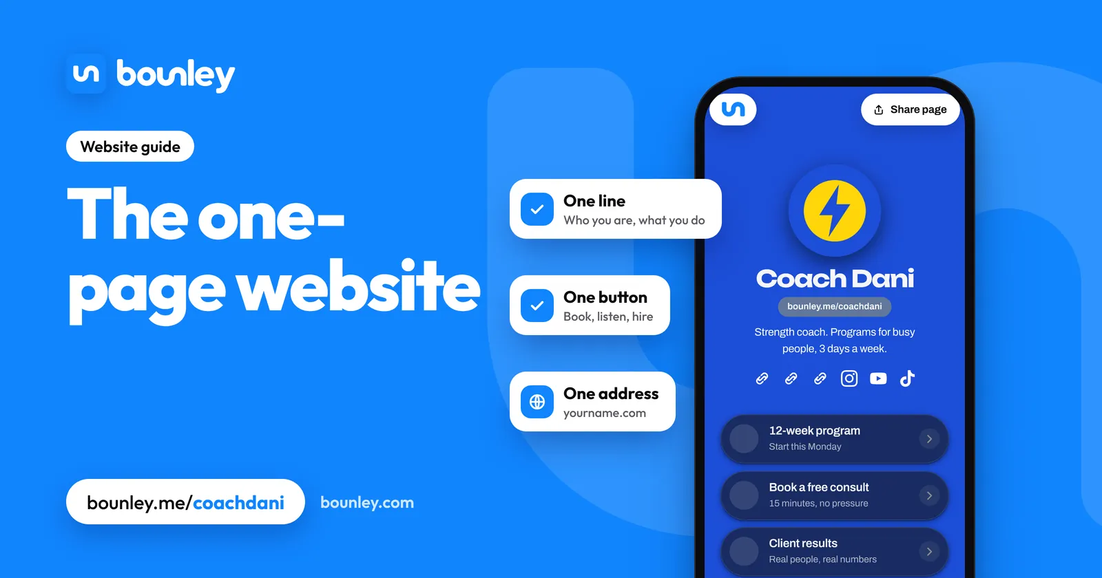
- Your name and one line on what you do and for whom. “Wedding photographer in Austin.” “I help software teams launch.”
- The main action, as a button, before any scrolling: Book a call, See my work, Listen now.
- Proof: three to six pieces of work, results, logos of clients, or a short quote from one.
- What you offer: the two or three things people can hire or buy, each in a sentence, with a price or “from” where you can.
- About you: three or four sentences and a photo. How to write it.
- Your links: the accounts where you’re active, and nothing you’ve abandoned.
- Contact: an email address at your own domain, and a form if you want enquiries sorted. Repeat the main action here.
On a phone, which is where it’ll be read, the first screen is items one and two. If those are clear, the rest is support.
What it looks like, by job
| Who | First button | Proof |
|---|---|---|
| Freelance designer | See case studies | Three projects with results |
| Coach | Book a free call | Client outcomes, in their words |
| Musician | Listen to the new single | Tracks that play on the page, tour dates |
| Photographer | Check a date | Six photos, one per kind of shoot |
| Job seeker | Download résumé | Two projects and what they achieved |
| Speaker | Book me to speak | A reel and past events |
Personal website examples by job shows real layouts.
When you need more than one page
- You write regularly. Articles need addresses of their own so each can be found and shared. A blog beside the one-page site does this. A blog on your own domain.
- You want to be found by topic, not just by name. One page can rank for your name; it can’t rank for thirty subjects.
- You sell many products and need a shop with a checkout.
- Each service needs explaining at length, with its own questions and prices.
Start with the one page anyway. It becomes the home page of whatever comes later.
Common mistakes
- A welcome message where the one line should be.
- No button until the bottom.
- Everything you’ve ever made, with nothing marked as the best.
- A contact form and no email address. Some people won’t use a form.
- A free address from the builder in the bio. Why the address matters.
A one-page site still deserves its own name
The size of the site and the address it lives at are separate decisions. One page at yourname.com, with email at the same name, reads as an established business; ten pages at a free address don’t. The domain is typically $10 to $20 a year.
Make one with Bounley
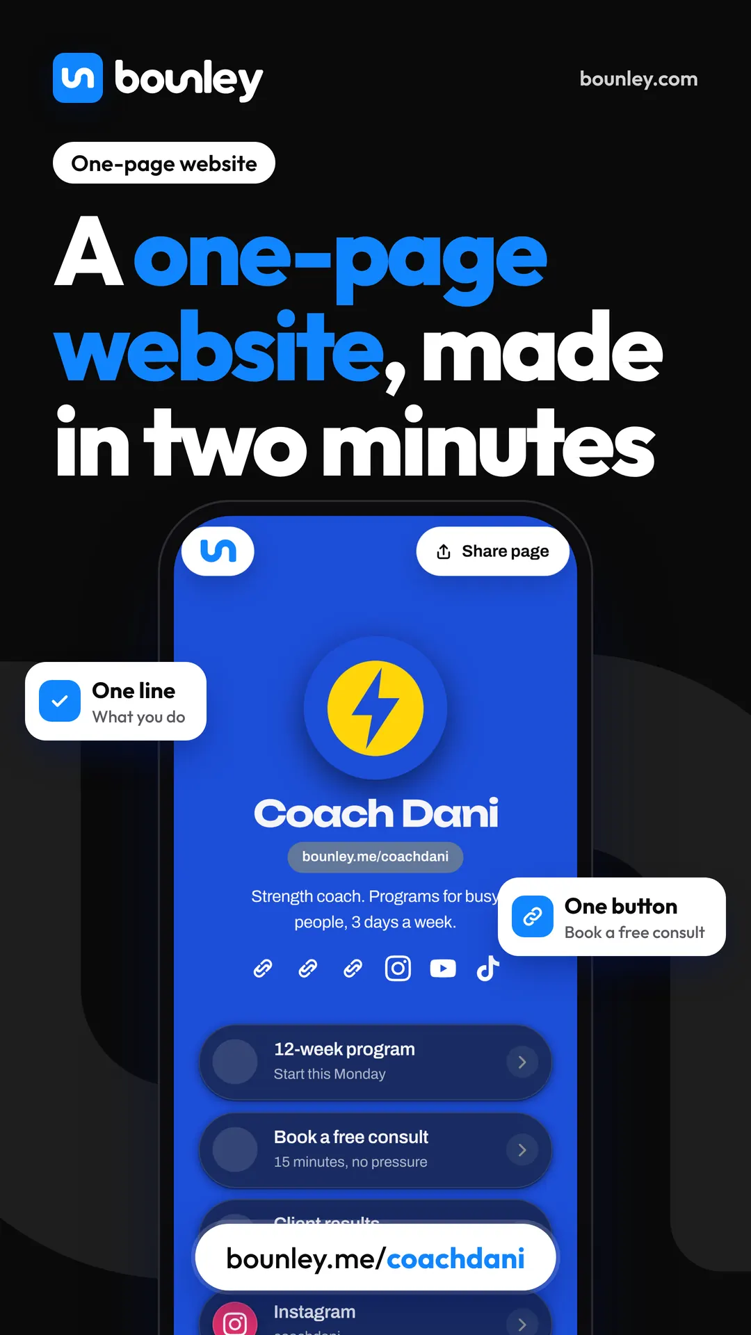
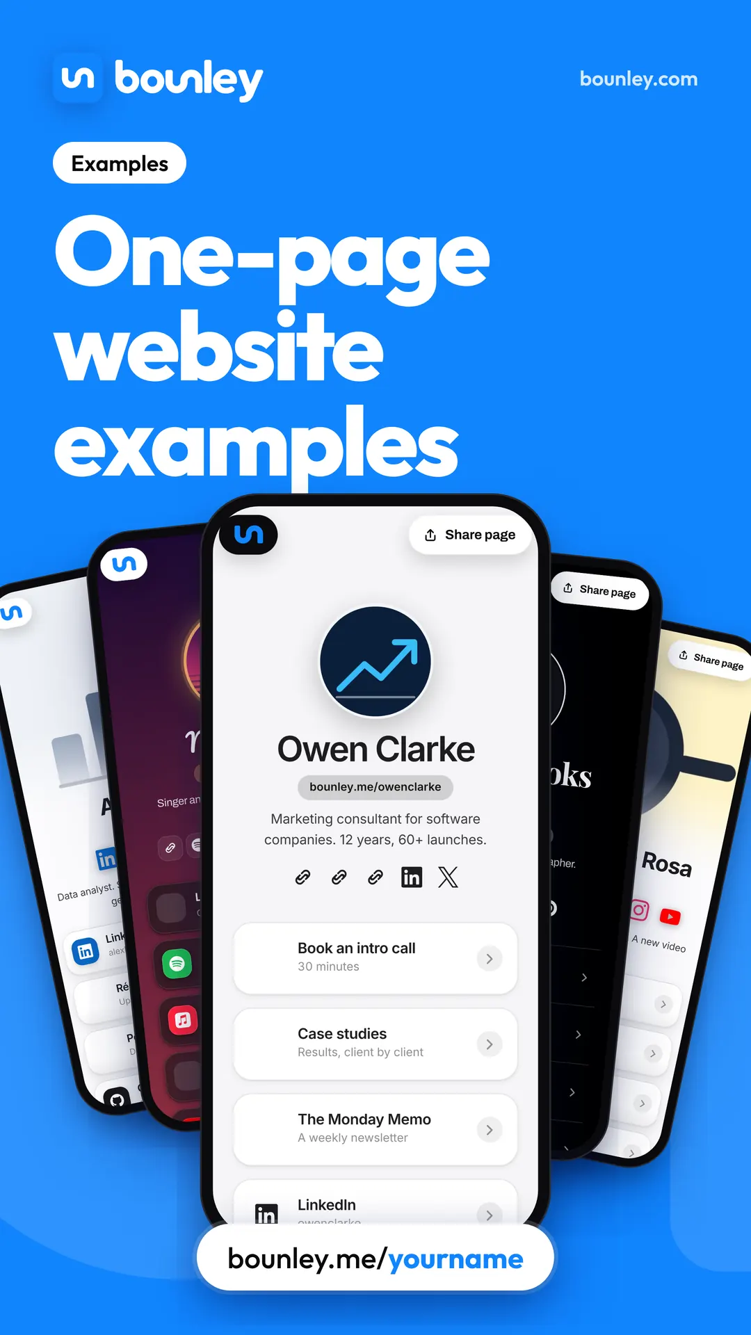
Bounley is built for exactly this. Type one username and it finds your accounts and makes your page in about two minutes: your name and line, buttons for what matters, videos and music that play in place, your links and a contact form, with 21 looks made from your photo’s colours. It’s free at bounley.me/yourname during the beta. Premium moves it to yourname.com with an email address and a blog: join the waitlist.
Questions
Is a one-page website bad for SEO?
Not for being found by your name, which is what most personal sites need. It’s limited for ranking on many different topics, because each topic wants a page of its own.
Is a one-page website the same as a landing page?
Nearly. A landing page is built around one campaign or offer; a one-page website is your whole presence. The structure is the same.
How long should it be?
As long as it takes to cover the seven parts, and no longer. Three to five screens on a phone is typical.
Can I add pages later?
Yes. Add them when a specific need appears, such as a blog or a booking form, not before.